Fulham


Fulham FC has made a number of minor changes to its crest over the years but this new crest is in fact the fourth completely new design.
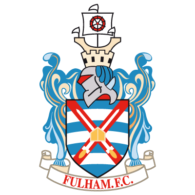
The first crest (a large black image of Craven Cottage) used wasintroduced in 1931 when it was felt the club needed a new identity. A second crest - that of the London Borough of Hammersmith and Fulham - was first used in 1947 following the end of the second world war.
A simple 'retro FFC logo', introduced in 1972 was to last just five years before the reintroduction of the London Borough of Hammersmith and Fulham crest in various guises.
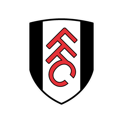
The new crest (shown above) has been carefully designed to coincide with a new generation of supporter and appeal more to younger fans in particular, while also providing a strong brand for the club. Its modern outline shape is taken from the shield of the previous crest. The clean and distinctive bold outline emphasizes stability while the club's two core colours - black and white - are represented by its wide bars. The letters 'FFC', that were so popular during the mid-1970s, are prominently visible, but this time in a modern format, linked together for cohesion and using the club's reserve colour of red.
The unique design aims to be much more easily recognisable to football fans around the world and sits nicely when placed side-by-side with the crest of other top British and European clubs.
Thanks to Ben Adcock, Research and Project Co-ordinator at Fulham FC, for the above crest and information.
